On Tuesday, a coalition of partners from the City of Cleveland, Cuyahoga County, and various nonprofit and civic organizations held a press conference at City Hall to announce the “Lead Safe Cleveland Coalition,” a group committed to addressing the city’s appalling child lead poisoning crisis within the next decade.
The announcement is welcome, if disgracefully overdue. Over the weekend, Rachel Dissell and Brie Zeltner – the award-winning Plain Dealer journalists who arguably deserve more credit for producing this outcome than almost anyone else in this region (save some of the wonderful activists who have been on the front lines for years) – previewed the announcement with an article on Cleveland’s long and sordid history of failing to remedy this issue.
Unsurprisingly, given our ignoble history of segregation, lead poisoning largely falls along racial lines. In a recent post, the Scene’s Sam Allard demonstrated the strong correlation between the racial composition of K-8 schools and the share of students with elevated blood lead levels in the Cleveland Metropolitan Schools District.
But lead poisoning is hardly the only health burden which is unevenly distributed in Cleveland. Last month, Kate Warren from the Center for Community Solutions examined the stark racial disparities in Cleveland across a number of different measures of health and well-being. According to her report, the infant mortality rate for African-American babies in Cleveland is 15.2 deaths per 1,000 lives births, 5.8 times higher than the rate for white babies. And, due in part to this mind-boggling fact, African-Americans in Cleveland can expect to live nearly 6 years less, on average, than whites (72.4 vs. 78.1 years).
Defining and understanding Environmental Justice
This intersection of socioeconomic/demographics and public health outcomes lies at the heart of environmental justice (EJ), a concept which has been a formal part of federal environmental governance since President Clinton signed Executive Order 12898 in 1994.
According to the U.S. Environmental Protection Agency (EPA), which oversees the work in this area, EJ is “the fair treatment and meaningful involvement of all people regardless of race, color, national origin, or income with respect to the development, implementation and enforcement of environmental laws, regulations and policies.”
To help promote EJ in its work and the work of agencies and organizations which receive federal funding, EPA rolled out EJSCREEN, its Environmental Justice Screening and Mapping Tool, in 2015. This tool, which collects data on a number of indicators across the country, enables users to see which parts of a community either bear the burden of environmental harms, suffer from socioeconomic disadvantage, or both.
But, as with most mapping tools of this sort, while EJSCREEN does a great job demonstrating patterns of environmental or socioeconomic disadvantage, it does not enable you to see which neighborhoods suffer from the greatest concentrated burden.
We know, for instance, that lead poisoned children will suffer lifelong cognitive and behavioral impacts. But children who grow up in close proximity to heavily trafficked roads and are exposed to higher levels of transportation-related air pollution suffer comparable impacts. In turn, children born into communities with high levels of poverty and violent crime suffer from toxic stress, a form of social pollution, which also has similar consequences for their well-being.
The cumulative burden of environmental harms
Taken in isolation, each of these variables takes a major toll. But what about when they’re layered on top of one another? The research makes it clear that exposure to multiple environmental and socioeconomic harms is not the same as exposure to just one or two. Rather, people, particularly vulnerable groups like children and the elderly, who live in communities of disadvantage suffer concentrated effects that make them susceptible up to more hazards and reduce their ability to stave off their effects.
There is also a complex interplay among the environmental and socioeconomic factors involved. Scholars have engaged in a long-running debate about whether companies intentionally site hazardous waste facilities in communities of color, or if minority groups move into neighborhoods with existing hazardous waste sites because they depress housing costs.
In a 2015 study, researchers Paul Mohai and Robin Saha examined this question, finding support for the former theory. Their results were “consistent with the ‘path of least resistance’ (sociopolitical) explanation of racially and socioeconomically disparate siting. This sociopolitical explanation posits that the siting of [locally unwanted land uses] tends to occur in communities that, relative to other communities, may lack political clout and resources needed to effectively oppose new facility siting proposals.”
Last fall, in order to better illustrate these cumulative environmental and socioeconomic disadvantages, researchers at the Natural Resources Defense Council (NRDC) created the “Cumulative Burden of Environmental Exposures & Population Vulnerability in Chicago” map, utilizing data from EJSCREEN.
I came across this map last week while reading an article on it in Pacific Standard, and I was struck by the way that it attempted to quantify the cumulative impacts of EJ concerns on neighborhoods in a way that I had not seen before. I immediately decided to look into the methodology to determine whether or not I could replicate it for Cleveland.
Getting into the weeds of NRDC’s methodology
Fortunately for me, the process was relatively straight forward, and the NRDC researchers provided a detailed description of how they created the map.
Relying on a modified version of the Environmental Justice Screening Method (EJSM) approach, which was developed by a team of academics at universities in California, the NRDC team modified data from EJSCREEN to measure the cumulative EJ burden on block groups in Chicago.
EJSCREEN includes data for every block group in the US for 11 environmental indicators and 6 population indicators:
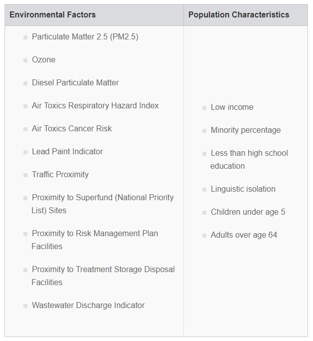
In order to translate these 17 different measures into a single cumulative EJ burden score, NRDC downloaded the data for every block group in Chicago from the EJSCREEN data portal. Next, they assigned a quintile score (1-5 based on the value of the variable) to each block group for each indicator. A score of 1 on a given indicator meant that block group was in the lowest 20% for that given measure, while a score of 5 means the block group is in the top 20%.
NRDC then summed the quintile scores for the 11 environmental and 6 population indicators to create total scores for each area; any block group could get a max of 55 and 30 on environment and population, respectively. Next, they assigned quintile values for both of these combined scores and summed those values, meaning a block group could have a cumulative EJ burden score ranging from a low of 2 (bottom quintile for each environment and population) to a high of 10 (top quintile for both).
Creating EJ maps for Cuyahoga County & the City of Cleveland
I applied this exact same methodology to block groups for both Cuyahoga County and the City of Cleveland. The only difference is that NRDC used EJSCREEN2017 data, while I took the updated numbers from 2018. I based quintile scores on the entire population of block groups in the county and city. In other words, quintile scores in Cuyahoga County included every neighborhood from Bay Village to Woodmere, while the scores for the City of Cleveland were only based on block groups within the city proper.
[If you would like to look at the raw data for each block group (including indicator values and quintile scores for all 17 measures), I have uploaded the spreadsheet to Google Sheets.]
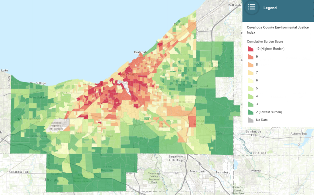
The map for Cuyahoga County is available below, or you can view it on its own. [For some reason, the shapefile I used did not include block groups in Brecksville or Hunting Valley, so these are not shaded, but the data for each is available in the spreadsheet.)
Unsurprisingly, the highest combined EJ burden scores occur in the City of Cleveland. There are 1,151 block groups for which I have data in Cuyahoga County. Of these, 72 have a cumulative burden score of 10; 70 out of these 72 block groups are located in the Cleveland, with one each in Linndale and Parma.
Moreover, of the 130 block groups with a score of 9, 118 (91%) are in Cleveland. The only other city with more than one block group with a score of 9 or 10 is East Cleveland, which has 9. While the average cumulative burden score for all block groups in the county is 5.8, the average for Cleveland’s block groups is 8. If you remove Cleveland, the average score for the County falls to 4.4.
Turning to the map for the City of Cleveland, which is below (or available here), we see that, while many of the block groups with the highest cumulative burden scores are clustered on the East Side, as expected, higher scores are spread throughout the city.
Eleven block groups have a cumulative burden score of 10; these are scattered throughout 7 different neighborhoods, including 4 block groups in Central, 2 in Broadway-Slavic Village, and 1 each in Clark-Fulton, Cudell, Downtown, St. Clair-Superior, and Tremont. While 27 of the block groups that scored a 9 or 10 are located on the East Side, another 26 are located on the West Side, and another 3 are Downtown or in the Industrial Flats.
Trying to make some sense of the data
As the map and these numbers suggest, the highest EJ burden appears to be distributed among the neighborhoods located in or near former industrial facilities or, to a lesser extent, interstates. The 3 environmental which seem to predict the highest cumulative burden are Proximity to Treatment Storage Disposal Facilities, Proximity to Risk Management Plan Facilities, and Lifetime Air Toxics Cancer Risk. Block groups in the top quintile for these indicators have average cumulative burden scores of 7.6, 7.5, and 7.4, respectively.
Interestingly, the 3 environmental indicators with the lowest predictive power are Proximity to Superfund Sites, Summertime Average Ozone Levels, and Lead Paint Indicator (Pre-1960s Housing Stock). Block groups in the top quintile for these have average burden scores of 4.9, 5.2, and 6.1, respectively.
These numbers seem to reflect the fact that certain environmental hazards (e.g. lead paint and ground-level ozone) are widely dispersed throughout the City of Cleveland, while others (e.g. Proximity to Treatment Storage Disposal Facilities) are much more discrete and location-specific. While 63% of block groups have more than the average score for the Lead Paint Indicator, just 42% of block groups have an above average number of Treatment Storage Disposal Facilities.
Oddly, the Percent of Minorities in a Block Group has little predictive value for the cumulative burden score. Block groups in the top quintile for this indicator have an average burden score of 5.2, the fifth lowest of the Population indicators (behind just Percent Over Age 64). The two strongest predictors among the socioeconomic variables are Less than High School Education and Low Income.
Ultimately, as I noted earlier, it is less productive to try and isolate the single most “important” variable for the cumulative burden of EJ in Cleveland, as it is the layering of these various variables that creates this concentrated impact. The whole environmental justice burden on a given block group is greater than the sum of its parts.
The real takeaway from this exercise to pinpoint EJ hotspots in Cuyahoga County and the City of Cleveland is to better inform the targeting of policy interventions to redress these burdens. One example of this, as NRDC attorney Meleah Geertsma told Pacific Standard, is to better target the use of funds from the Volkswagen settlement to ensure that they are being invested in the neighborhoods where they can reap the most community benefit.
Hopefully these maps and the underlying data that I used to create them can also help to empower EJ activists living and working in these neighborhoods to both resist the imposition of new environmental burdens (e.g. the siting of new hazardous waste facilities) and to demand solutions from their elected officials.
The post New maps reveal Cleveland’s environmental justice hotspots appeared first on Tim Kovach.


